Philips Business School
From outdated classrooms to a varied apartment complex. That is the transformation that the Philips Bedrijfsschool in Eindhoven underwent. Architect Bram van Ekeren of diederendirrix Architecture and Urban Planning polished, puzzled, and discovered the most beautiful architectural finds.

Architect Bram van Ekeren of diederendirrix Architecture and Urban Planning.
The facade of the Philips Bedrijfsschool towers above the Strijp district like a large golden-yellow beacon. Many Eindhoven residents have received their education here in the last seventy years. In 2021, expats and former students mainly use the Holland2Stay short-stay lofts. There is also a steak restaurant and climbing gym. The building, designed by architect Dirk Roosenburg, is deeply anchored in the collective memory of the city of light because of its rich history. Bram van Ekeren was given the task of turning this institute into a dynamic urban residential complex with 442 loft homes. For him, this assignment was a lottery ticket. “This was my first project for my architecture firm. An icon in Eindhoven and I cycled past it every day. Truly an honor.”
Discovery journey
Van Ekeren can still remember his first exploratory visit to the striking building. He fell head over heels for its grandeur and raw character. “This building was built on a grand scale, completely in the Philips style. Almost ecclesiastical towering over the surroundings. Moreover, it is a building that every resident of Eindhoven knows. That inventory was real painstaking work. It is a listed building. As a result, it is under the magnifying glass of the municipality. I had to struggle through a thick pile of pencil sketches to get to know the school well. I liken it to a historical jigsaw puzzle. An instructive process because you learn a lot about the use of color of the tiles and the frames. It was just well thought out. I soon knew that the original design would become the starting point for the new design.

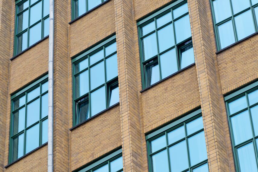
When we cleaned the facade, the original, golden yellow color of the building became visible. Now that makes for such a fresh look that people can't believe this is the original color.
The more Van Ekeren delved into the history of the building, the more pearls he discovered. Such as the original color of the facade, for example. Van Ekeren recalls: “The smoke from the former industrial area of Strijp-S has left its mark. When we started, the facade and masonry of the Philips Bedrijfsschool were shrouded in a veil of soot. In addition, a small part was defaced with graffiti. When we sprayed this clean, the original golden yellow color of the building became visible. This was such a revelation that we covered the entire facade. Now that makes for such a fresh look that people cannot believe this is the original color. The same goes for the frames. Color research showed that the original color of this was Veronese green instead of cream white. A color that you will find in many modernist buildings.
Playing with lofts
The eight-story building covers 418,178 sqft. Five building parts form the starting point. Over time, the school survived a bombing and several renovations. This resulted in a mixed architectural style. Van Ekeren saw a golden opportunity here to 'make architecture'. “The research revealed the building's versatility. The wealth that the school manages to hide on the outside is reflected in the houses on the inside. There were heights of 14 ft. but also 6.8 ft. This difference allows you to create homes that are spectacularly different from each other. This has resulted in more than thirty different housing types. At some, we have placed mezzanines. Other spaces lent themselves better to a void. How nice is it that you as neighbors can visit each other and step into a completely different home? I wanted to create cool homes without affecting the authenticity of the building. That totally worked.”


"It ended up being a facade to be proud of."
The facade is the business card of the Philips Bedrijfsschool. According to Van Ekeren, it was important to take a good look at the framework. “We were looking for a frame profile with a typically slender nose. This was important because you do not want to detract from the original architectural style. Reynaers Aluminum was able to help us in that search. Due to the renovations in the past, the sizes were not the same everywhere. Together with facade builder Wijmoco, they thought along with us about the final dimensions. You do not want to work with wider frames to fill spaces. This has been a beautiful interplay between Reynaers Aluminium and us. The facade is the first thing people see. That just has to be right. In the end, it has become a facade to be proud of.”
Used systems
Involved stakeholders
Fabricator
- Wijmoco Geveltechniek
Other stakeholder
- Stam + de Koning Bouw (General contractors)


